


A brand interpretation succeeds when it moves beyond what the brand sells to reveal what the brand means—the emotional and cultural space it occupies in collective memory.
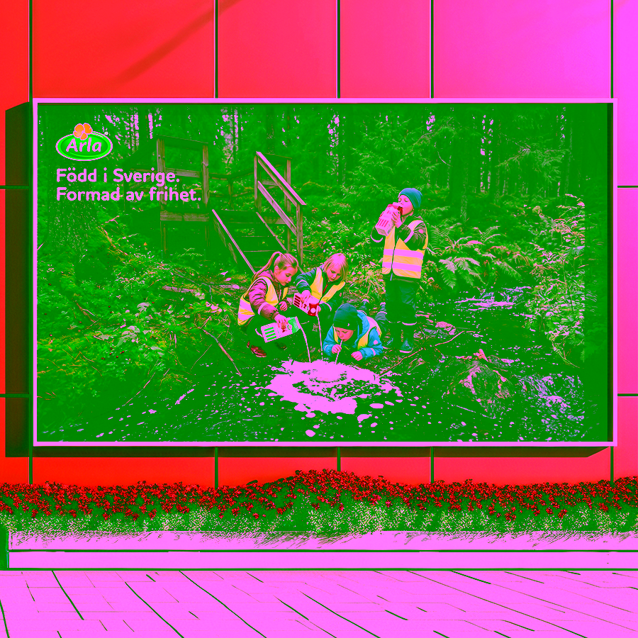
An authorial photographic interpretation of Arla—Sweden's most recognizable dairy brand and a cultural fixture woven into Nordic daily life. Rather than extending conventional product communication, the work asks: how might Swedish photographer Lars Tunbjörk reframe this institution? The project channels his sensibility—intimate, observational, and deeply rooted in Nordic identity—to explore what Arla means when seen through the lens of cultural belonging and domestic ritual.
The work abandons marketing logic in favor of narrative depth. Photography becomes a tool for interpreting identity: childhood memories, the material textures of Swedish domesticity, the unspoken rituals that anchor a culture. Each image operates as a conceptual study rather than a promotional asset, positioning the brand not as a product but as a symbol of continuity, trust, and the everyday practices that define a place and a people.

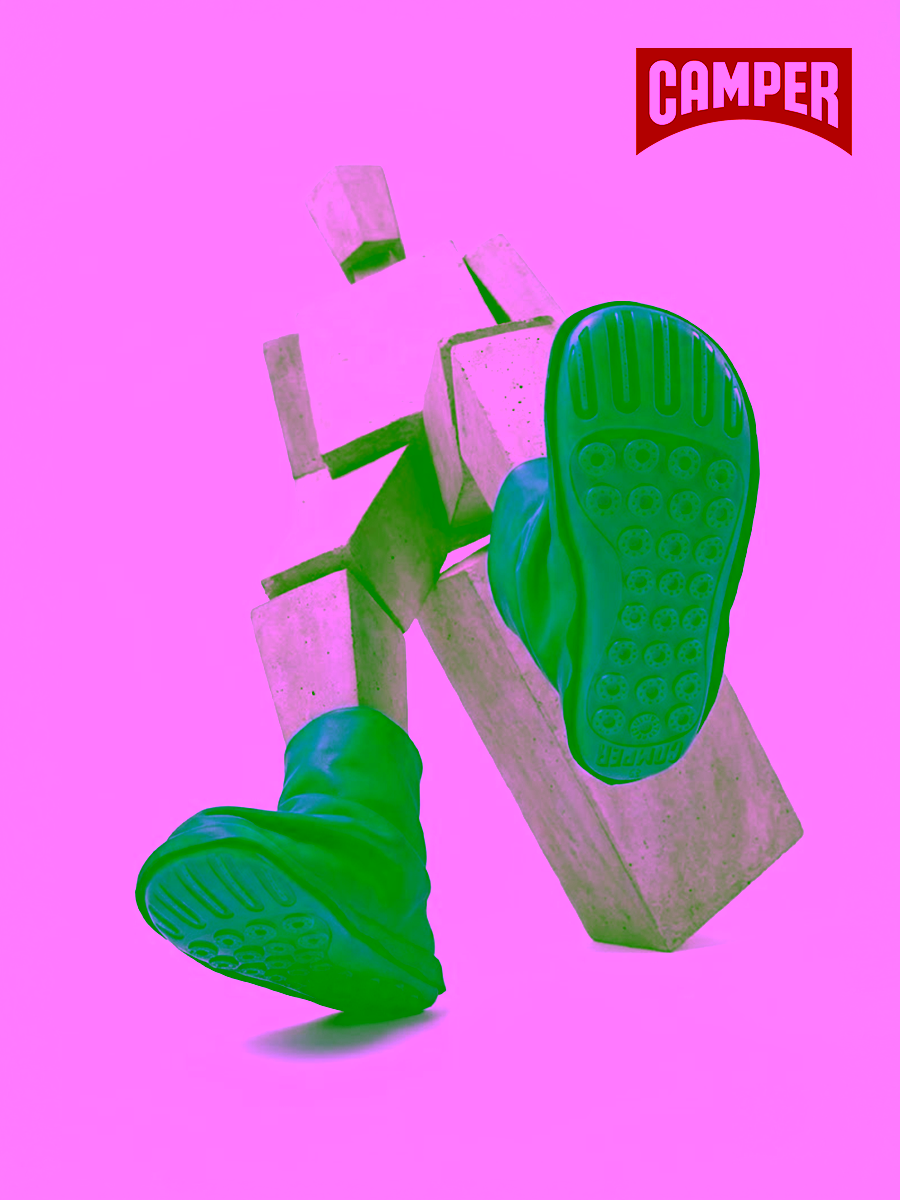
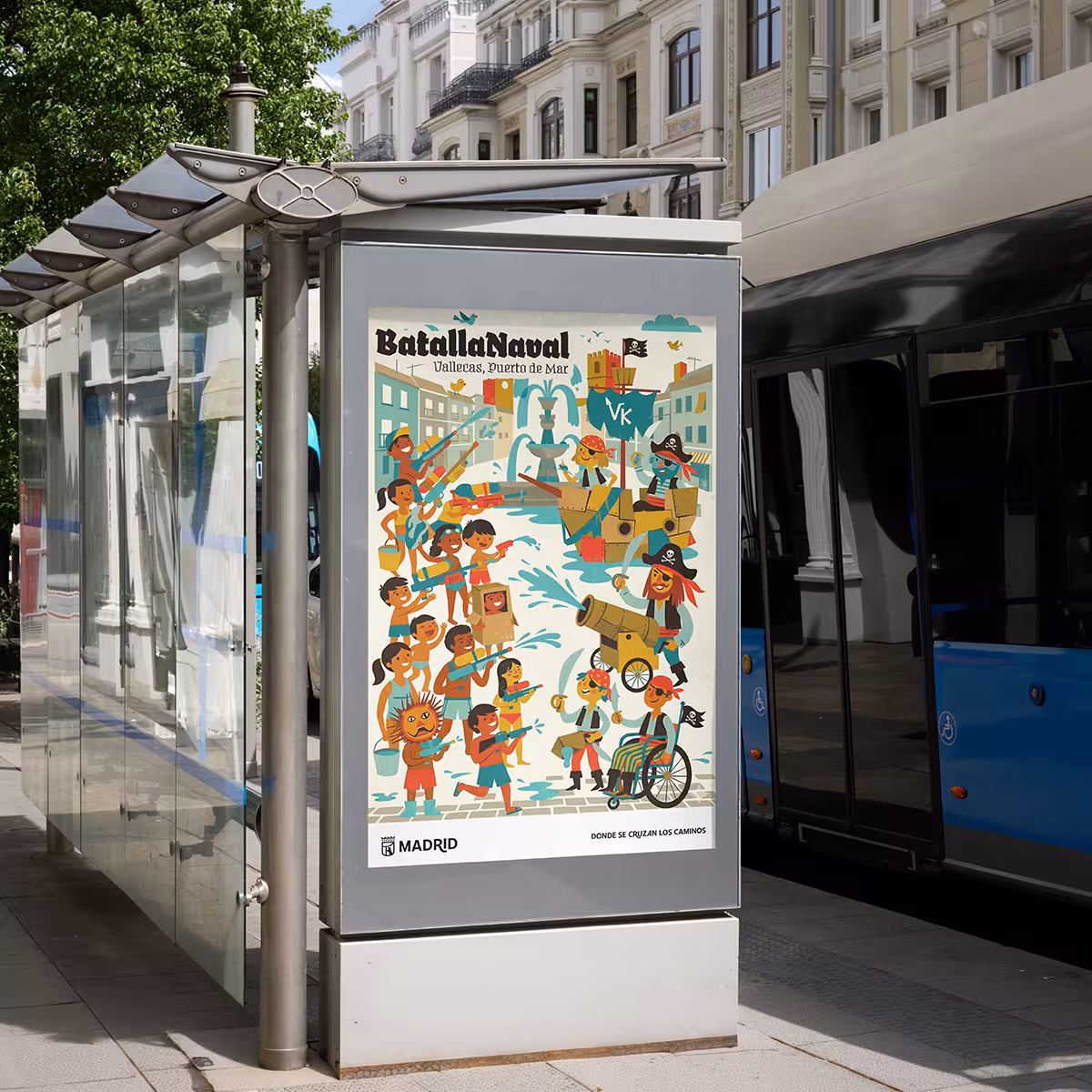
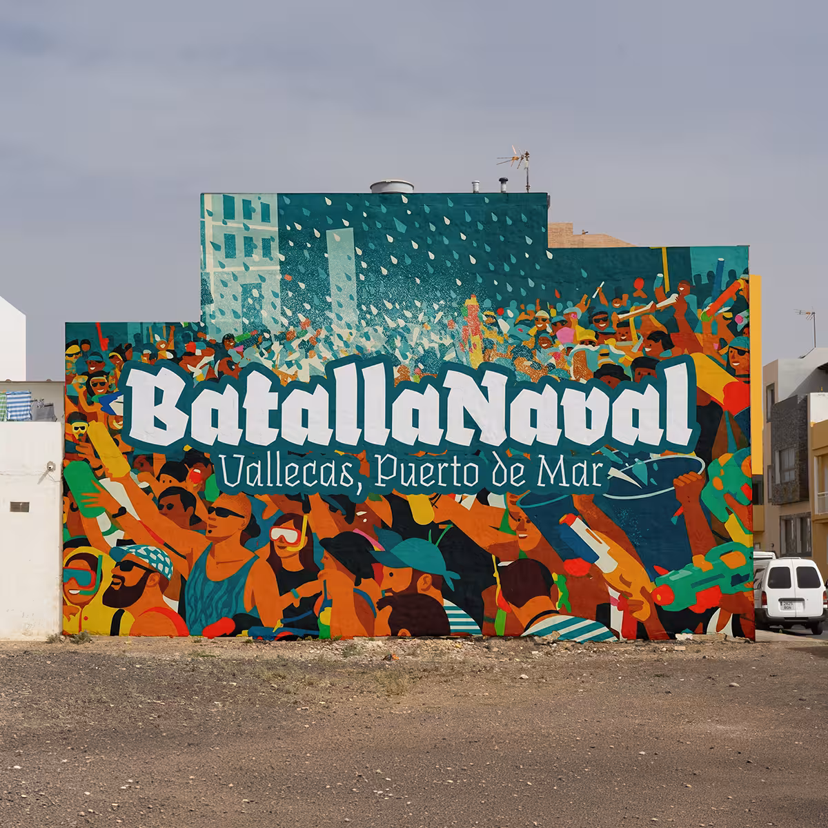
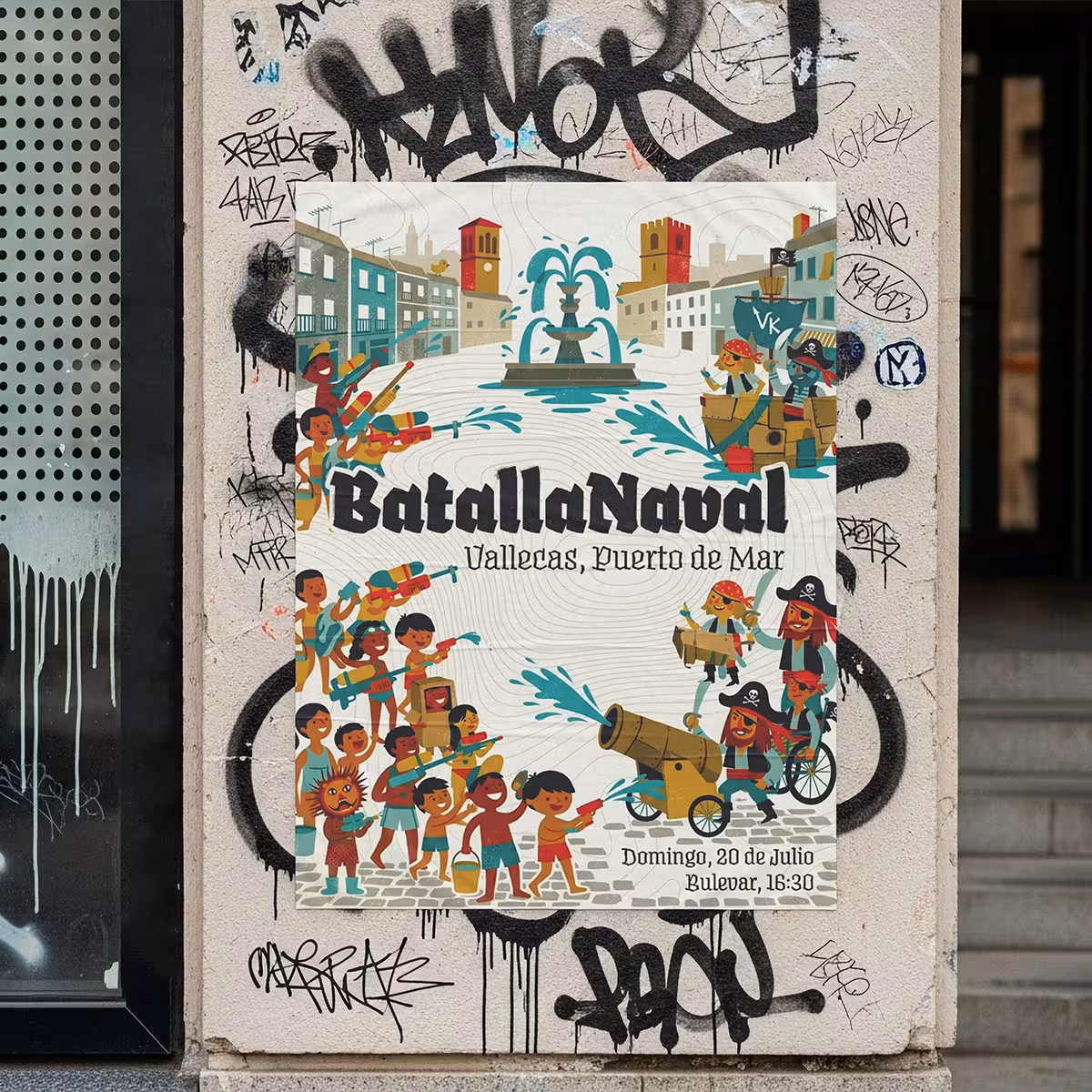
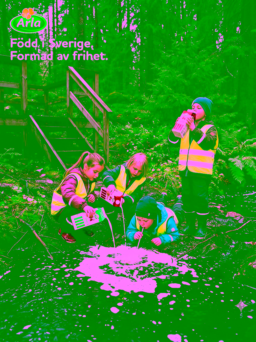 Campaign Poster
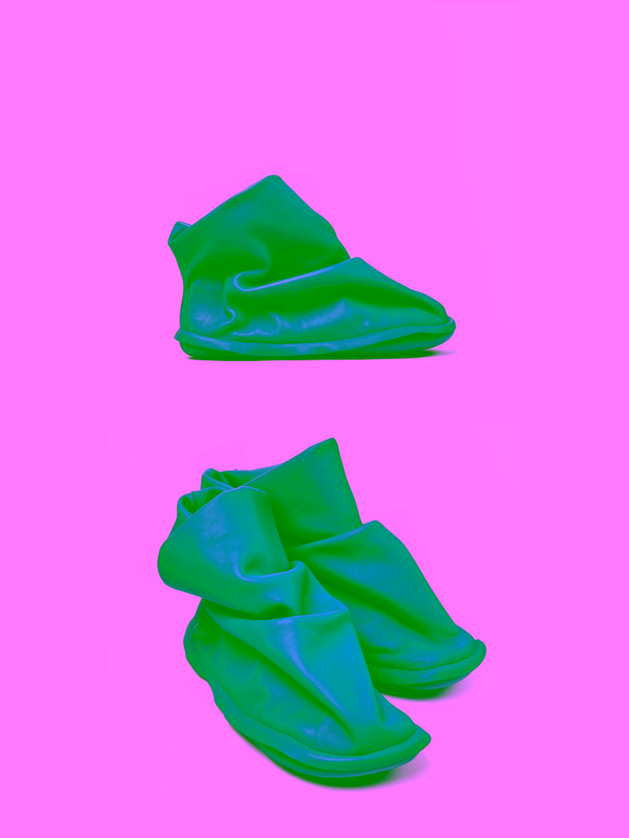
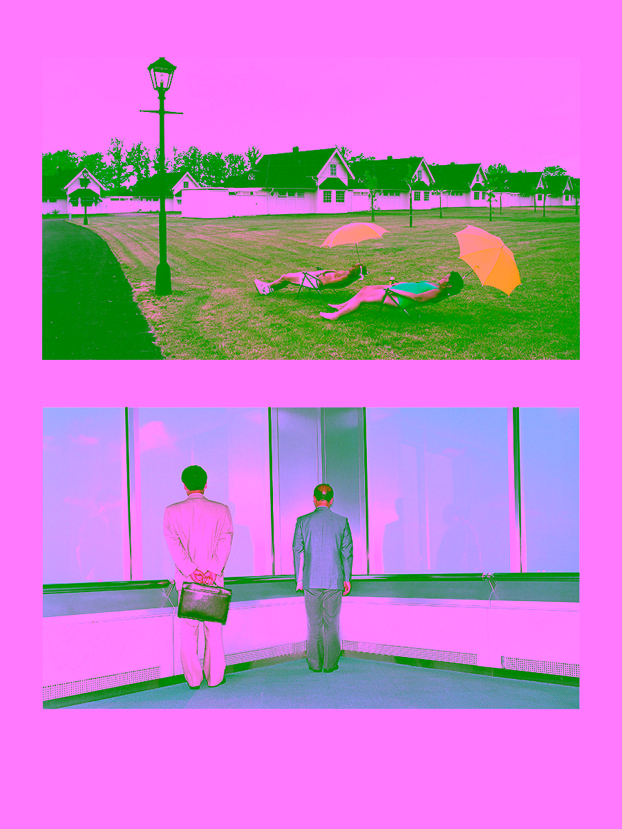 Tunbjork Study
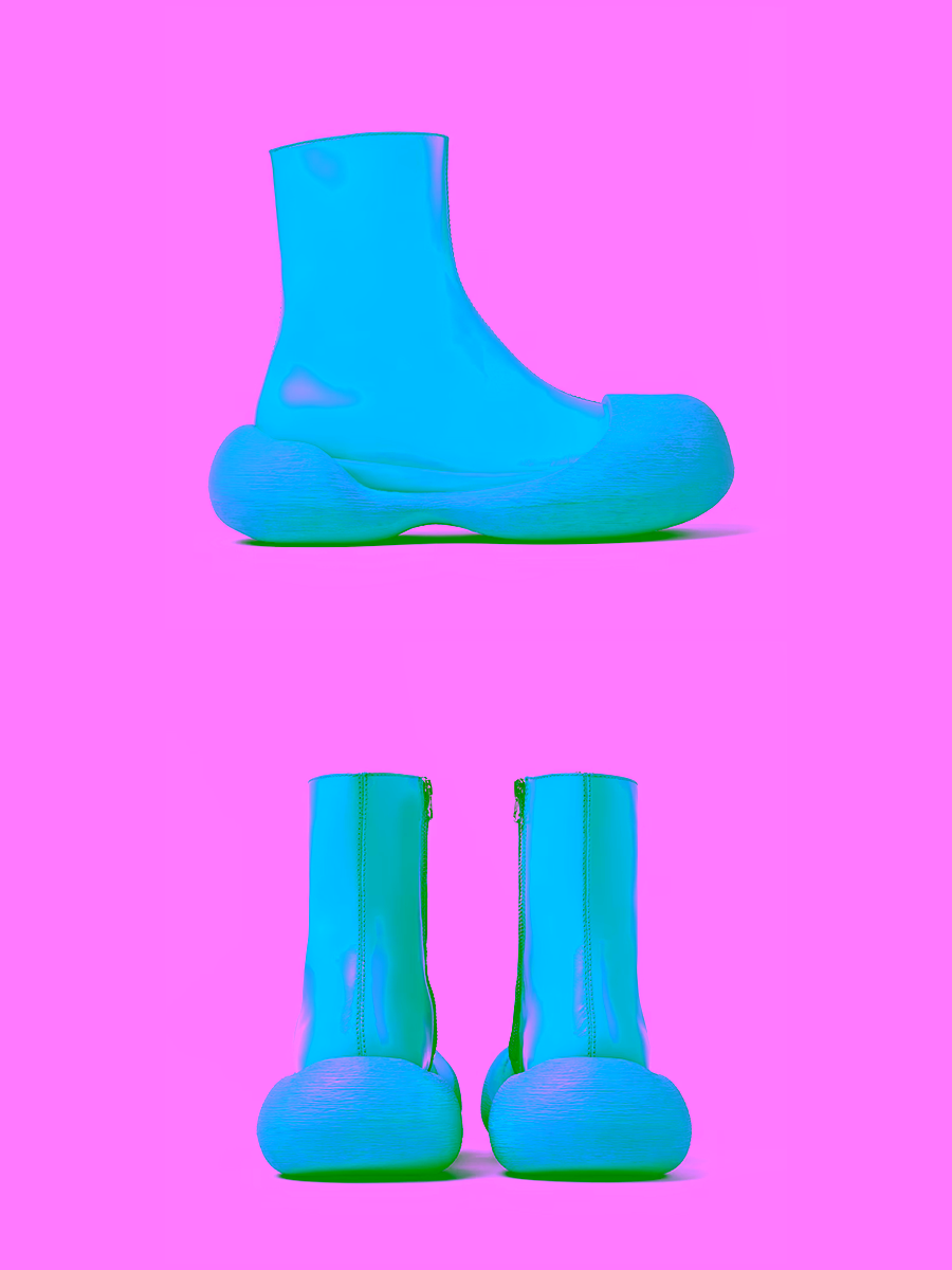
 Childhood Memory
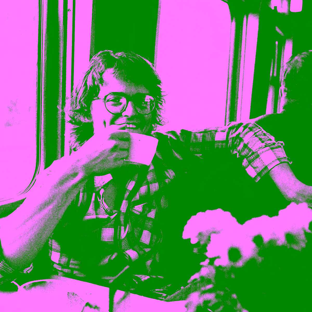 Lars Tunbjörk